
Because fashion related to home furnishings changes much more often than trends in shoes or clothes, designers try to keep their hand on the pulse and inform society about the latest trends. And in this case we are talking not only about style trends or the range of finishing materials. Determining the most appropriate color palette for the design of this or that room is also a very important action, because correctly selected shades help to reveal the character of the chosen design and help to create the necessary atmosphere.
Interior Colors 2024 – the main trends
Despite the fact that the planning of interior design, as a rule, takes place on the basis of the specific lifestyle of the owners of the premises and are implemented taking into account their wishes and interests, designers necessarily take into account trends in interior fashion. The main feature of modern interiors is the use of neutral and closest to nature colors, which create a cozy and relaxed atmosphere, for example, beige, olive, green, blue or amber. At the same time, do not disregard the bright colors such as red, samba or gold, which have been very successful as accents.
The choice of color variety is wide enough and any large interior design studio, such as Craftex will be ready to offer you design of your apartment or office in those colors that you choose.
Laconic Beige in the interior
With the proper prioritization of warm beige shade fills the room with elegance and a sense of tranquility. It looks good in company with gray, white, green, blue and is in harmony with coffee or chestnut, pink or terracotta. As the main shade, beige will never look dominant in the interior, so designers recommend not using it to create contrasting combinations.
Freshness of Green
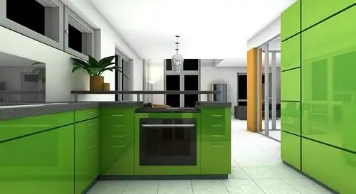
Lovers of conservatism are recommended to pay attention to the refreshing green color, which is able to maximize its qualities in eco designs and projects with a minimalist bias. For wall decoration in the latter proposal, it is better to use dark shades of green palette, which will allow you to emphasize the restraint of style. If we are talking about textiles or furniture upholstery, then it is advisable to prefer mint, ultramarine or emerald. To maintain the eco-trend, accentuate the shades of green grass, pine and other colors, as close to natural as possible.
Noble and relaxing blue
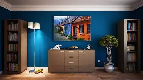
This year the trendy color blue is in a dark, deep shade that imitates tropical water, over which a misty haze lays. This kind of magical and enchanting option goes well with neutral tones and creates a relaxing and comfortable atmosphere. If desired, you can play with the components of the blue range and give preference, for example, in favor of shades with a more pronounced red or green undertones. Light colors will fill the room with coolness and create a peaceful atmosphere.
Trendy almond shades
With its versatility, almond shade is able to fill the room with a harmonious combination of tenderness and a certain coolness. It magically transforms the colors around it and looks great in a duo with graphite, green, blue and many other shades. At the will of the owners of the room, almond can be secondary or dominant in the interior. It all depends on the chosen style and the desired result. To the overall picture does not look too laconic, it is acceptable to use additional bright accents in the form of accessories or textiles.
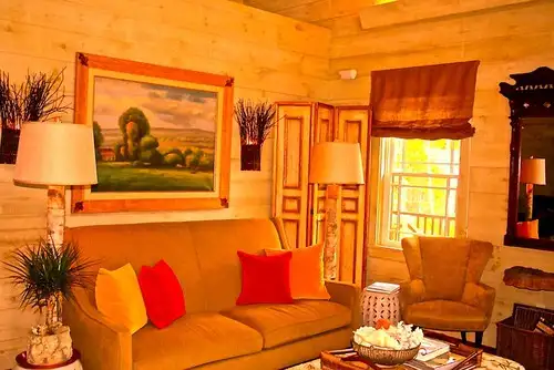
Sunny Amber
Because this color scheme includes not only yellow, but also red and orange hues, the iridescent sunshine characteristic of amber can vary depending on the degree of their concentration. Amber combines beautifully with beige, dark brown and even lilac shades. Even a small accent in the interior, made in such a cheerful scale, provides filling the room with cheerfulness, warmth and energy.
Extraordinary color samba
In fact, the proposed option is a harmonious combination of red and cherry color in equal proportions. It perfectly complements the calm or neutral shades in the interior and is mainly used in textile elements or decorative details. If this sensual and subtle color is present in the decoration of the walls, it is necessary to provide the room with different levels of light. The furniture in this version should also be combined in the interior with less expressive items. This solution will demonstrate the depth of such an unusual color and at the same time will smooth out its saturation.
Trendy golden shade
In the photo examples of finished interior works of recent seasons there are more and more frequent glimpses of gold. Therefore, in 2024, the use of the glow of precious metal in the design of the rooms can be called a topical and fashionable solution. You do not have to use a golden shade for the decoration of the entire room. Although this option also has the right to implement. Even small shiny accents on a red, black, green or beige background will significantly transform and ennoble the room.
The principle of choosing a stylish shade for the interior
To make the color scheme of your interior looked as harmoniously as possible, you should correctly determine the ratio of colors used in the design. The combination 60%+30%+10% in this case is considered the most rational. As a rule, 60% of the total color solution of the interior should account for the main shade. 30% must occupy its various additions. 10% are bright and flashy accents, without which most modern styles would seem too sugary and unfinished.